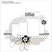
 I liked the idea of using four pictures on a page, until I actually tried to fit them. I want the pictures big enough for old eyes like mine to see, and the ones I wanted to use were all landscape rather than portrait. So I rotated the sketch 90 degrees and stuck with most of the basic shapes. Even when I have to stretch to make it all work, it is still easier having some sort of starting point from which to work. Thank you, ScrapMuch?! :o)
Most of what I used here was from #DCVW 's Kidlet Stack. This is another layout for DGD's page-a-month album.
Thanks for looking!


Very creative solution. The page looks great.
ReplyDeleteHow sweet, such darling photos, great take on the sketch! Thanks for joiinng us at ScrapMuch?
ReplyDeleteThis page looks great!! I love how you adapted the sketch to fit your pictures. Well done! Thanks for sharing with us at ScrapMuch?
ReplyDeleteSo sweet! Great take on the sketch
ReplyDeleteThank you for playing along at ScrapMuch?
Nice layout! Aren't sketches awesome that you can adapt them anytime and any way! Cute animal creature diecuts on your layout! Thank you for playing along over at the ScrapMuch?!
ReplyDeleteLove how you flipped the sketch! Fabulous! Thanks for playing along with ScrapMuch?!
ReplyDeleteGood idea! Sometimes I get stuck and then I realize I'm using the sketch too literally. Turning the sketch around is a great inspiration. Thanks for joining us at ScrapMuch?
ReplyDeleteGreat idea turning the sketch, love the LO.
ReplyDelete